Client: Warner Bros. Games
Studio: The Platform Group
Role: Junior Art Director / Graphic Designer
Tools: Photoshop, Jira, internal CMS
Studio: The Platform Group
Role: Junior Art Director / Graphic Designer
Tools: Photoshop, Jira, internal CMS
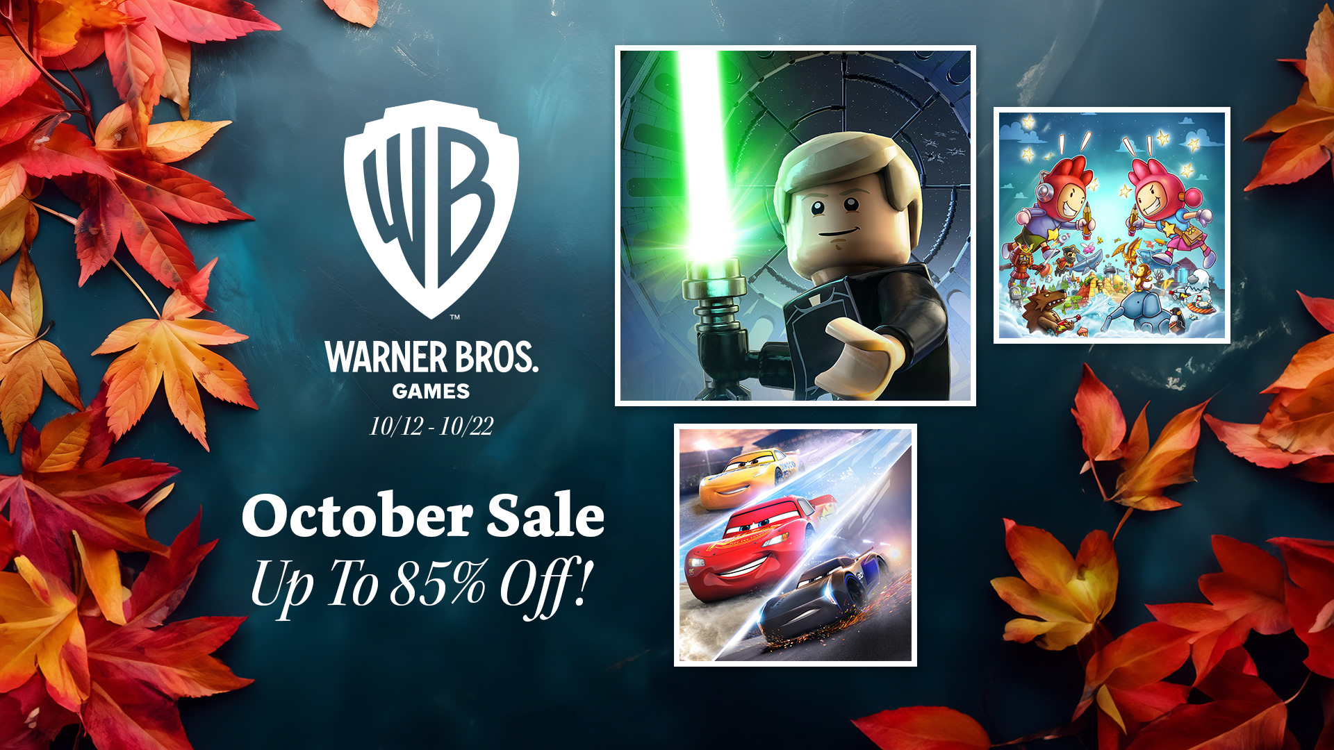
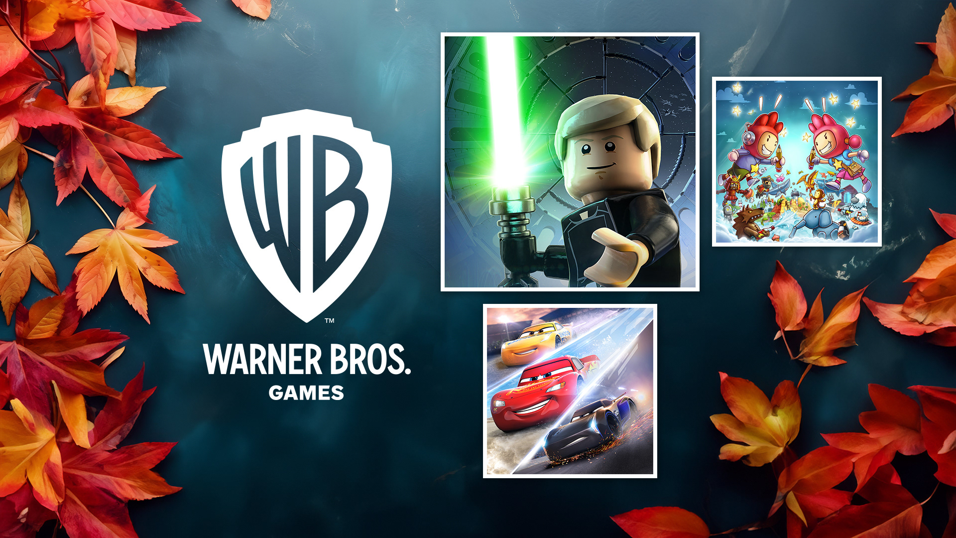
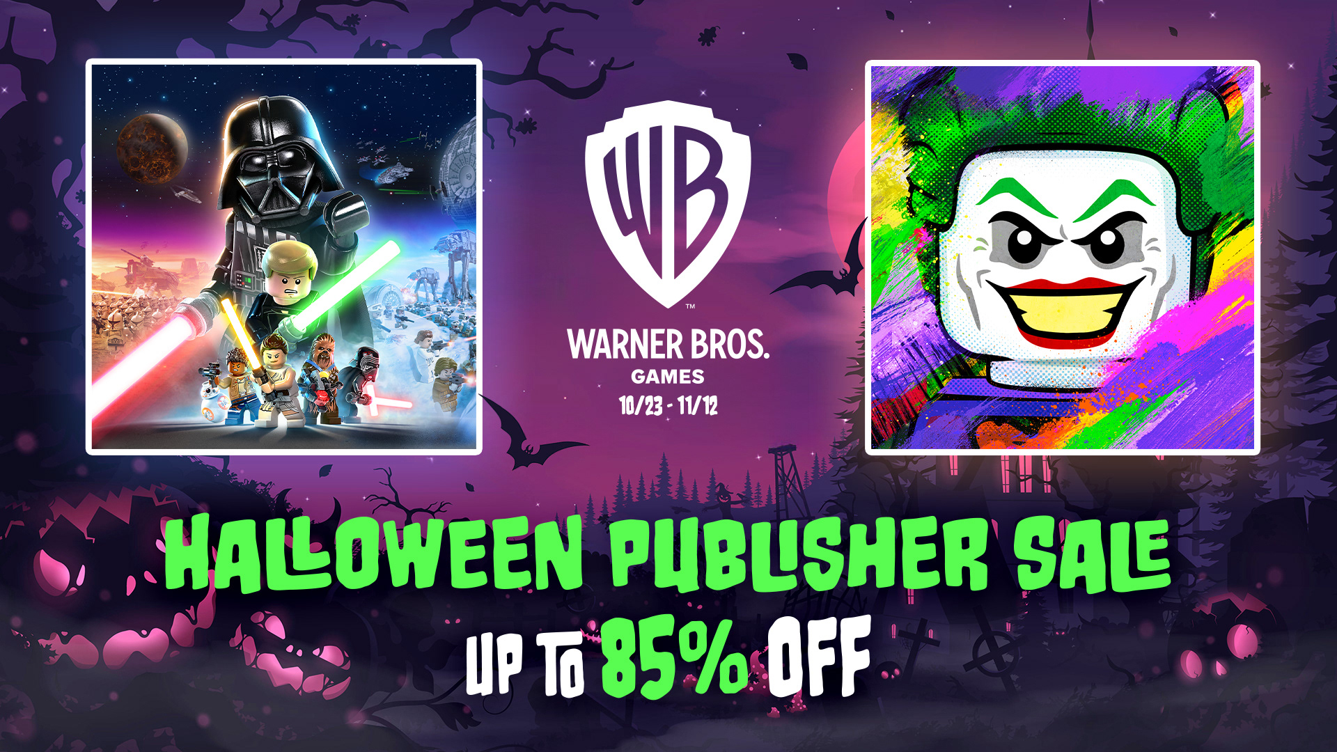
I led the design of several seasonal sale campaigns for Warner Bros. Games, including Fall, Winter, Halloween, and Franchise events across Steam and Nintendo. Each campaign required original layouts, custom treatments, and rapid iteration under tight deadlines. I handled stages from concept to final delivery, ensuring each design aligned with seasonal themes, platform specs, and brand standards.
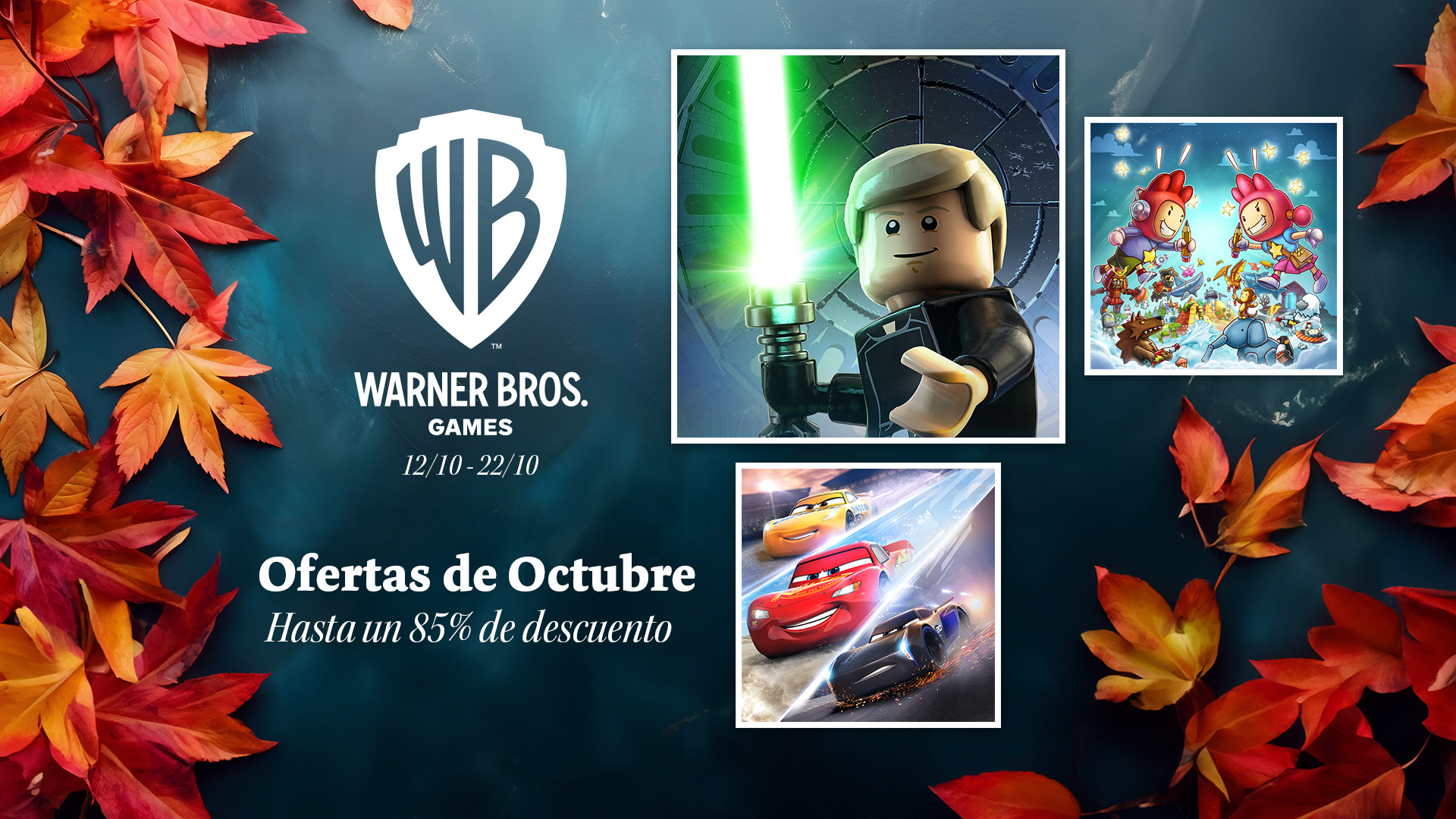
Fall Sale - Nintendo
Designed a clean and elegant storefront visual for the Nintendo Fall Sale, aiming to highlight featured titles while creating strong seasonal atmosphere. The bright autumn leaves were chosen to contrast vividly against a dark blue matte marble background, allowing the featured games to stand out clearly. The layout was kept minimal to maintain focus on the content and ensure clarity across multiple languages and storefront placements.

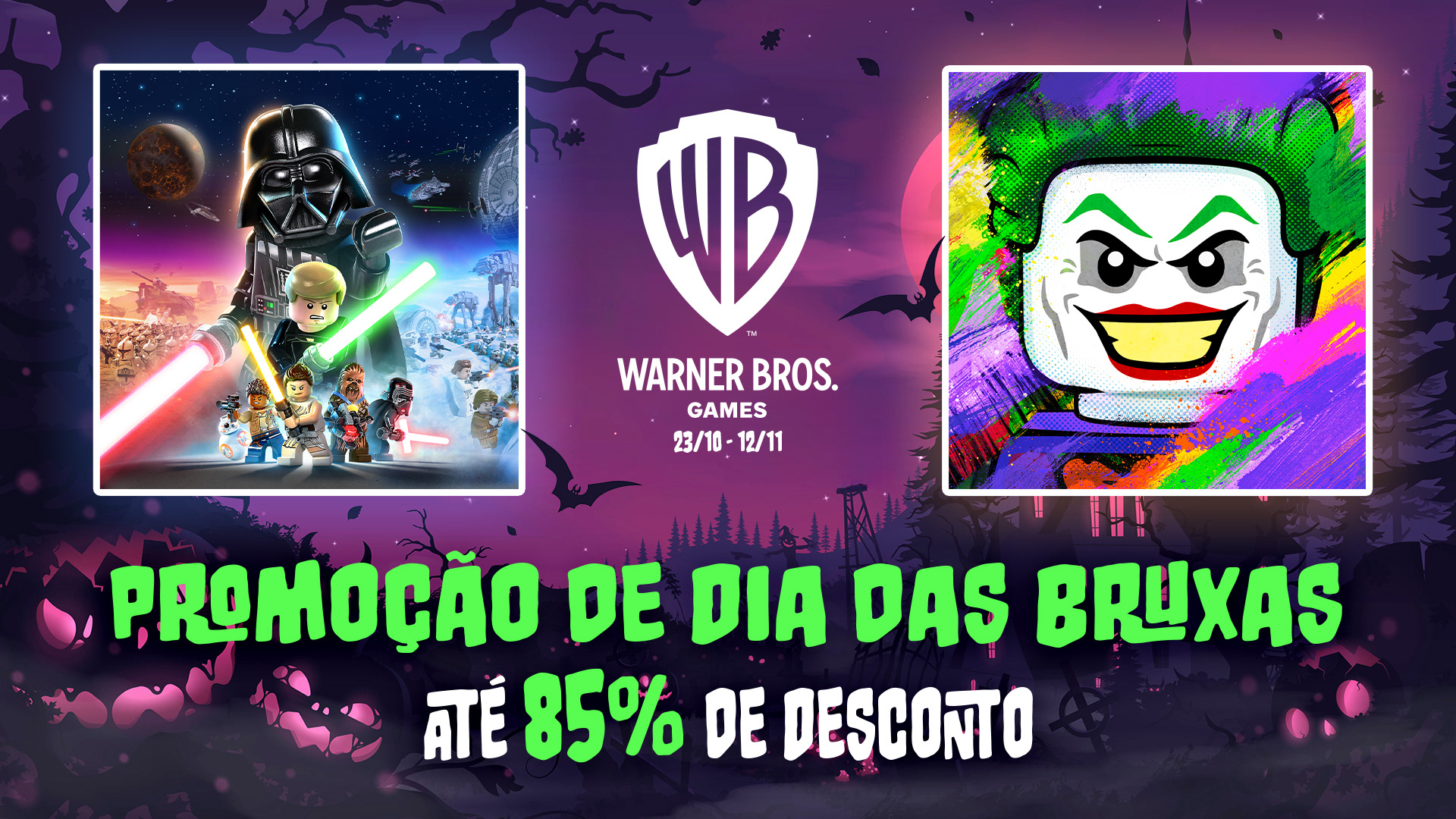
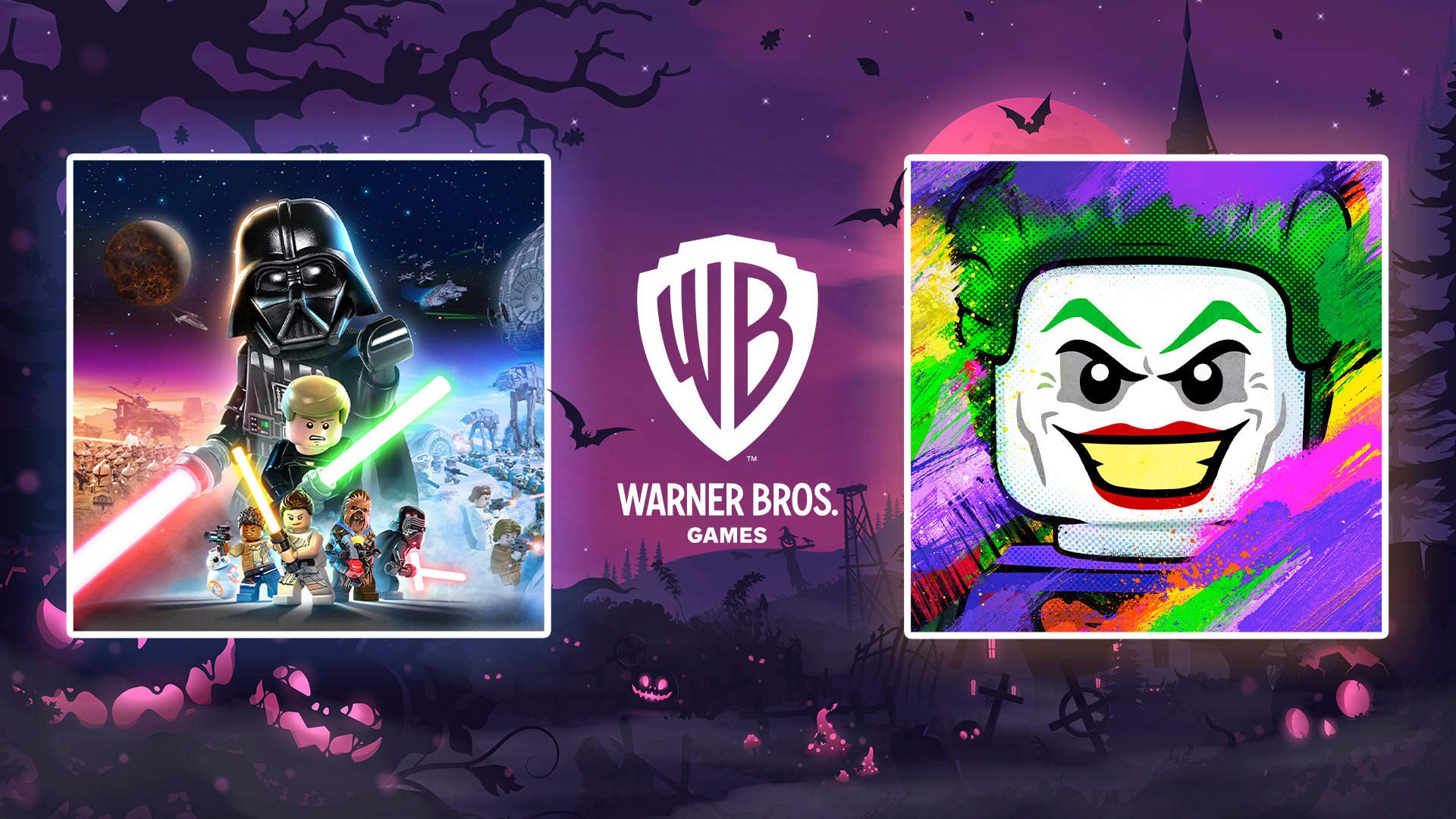
Halloween Sale - Nintendo
Created a playful visual for the Nintendo Halloween Sale that balanced seasonal themes with the platform’s tone. Rather than leaning into horror, the design embraced vibrant colors and stylized Halloween elements to complement the featured games’ artwork. The idea was to support bold character imagery while remaining fun, approachable, and on-brand for the games audience.
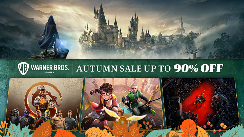
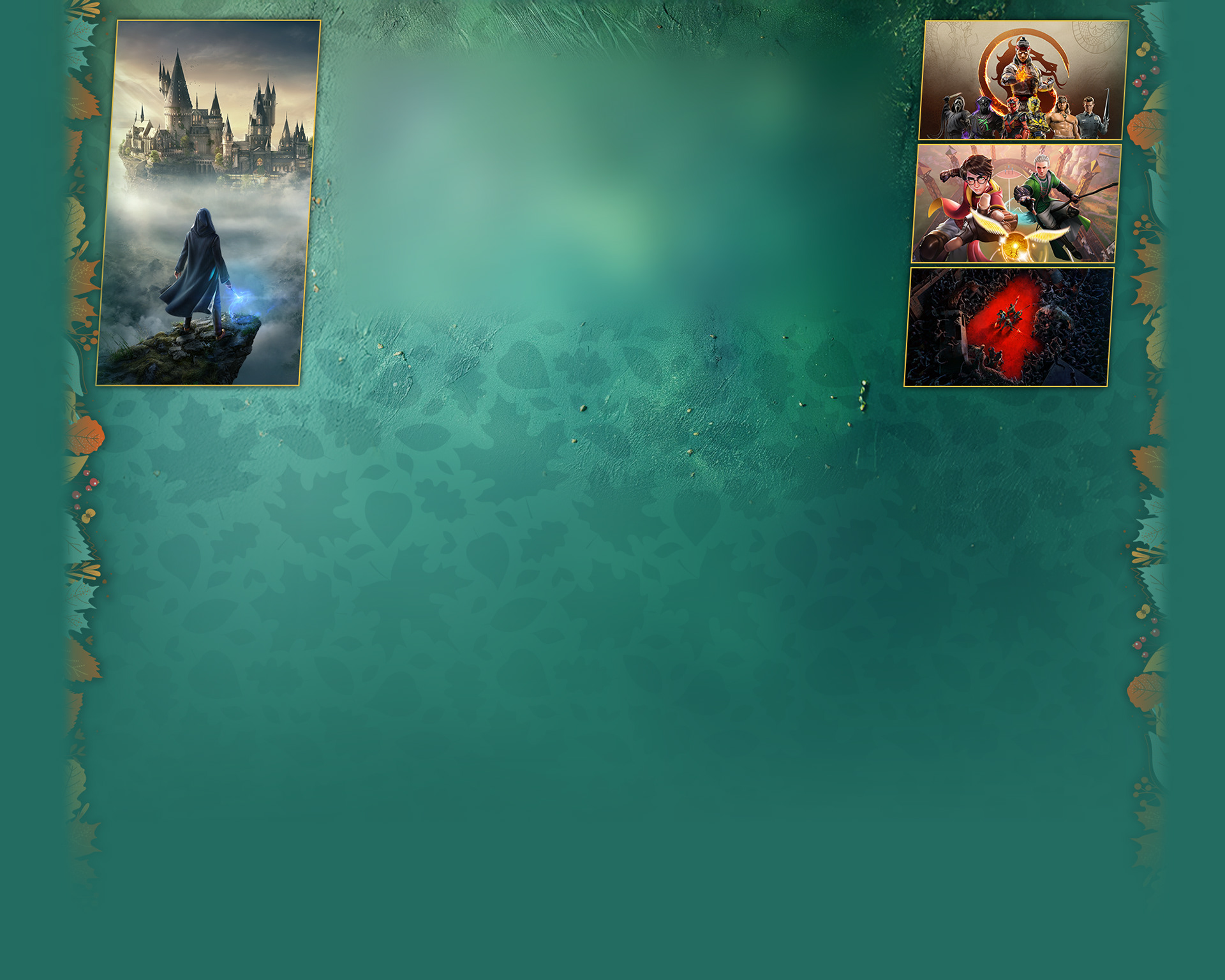
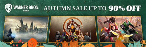
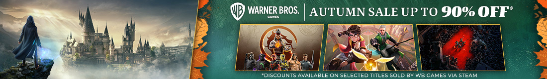
Autumn Sale - Steam
Designed a cohesive set of promotional banners for the Steam Autumn Sale, combining bold seasonal visuals with clean layout and strong brand presence. The design featured rich greens and oranges to evoke an autumn atmosphere while highlighting key titles and maintaining visual hierarchy across various banner sizes. Decorative foliage elements were used to frame the artwork without overwhelming it, allowing the game imagery and promotional messaging to stay clear and impactful.

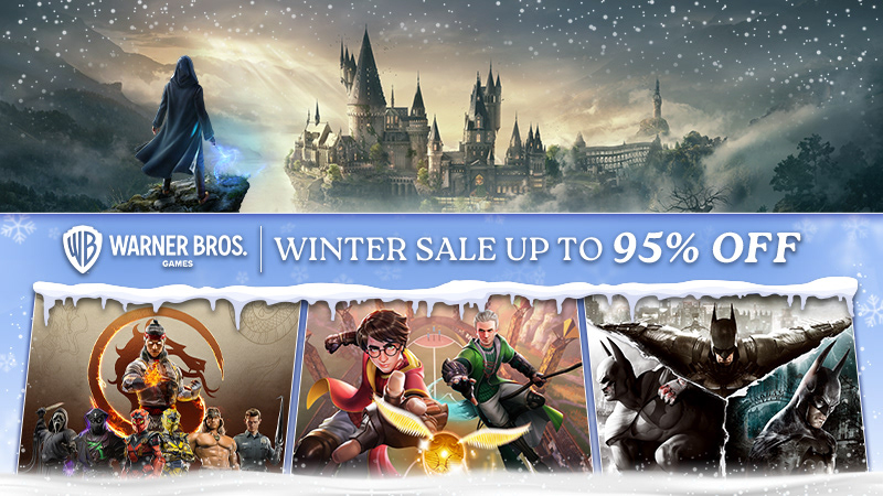
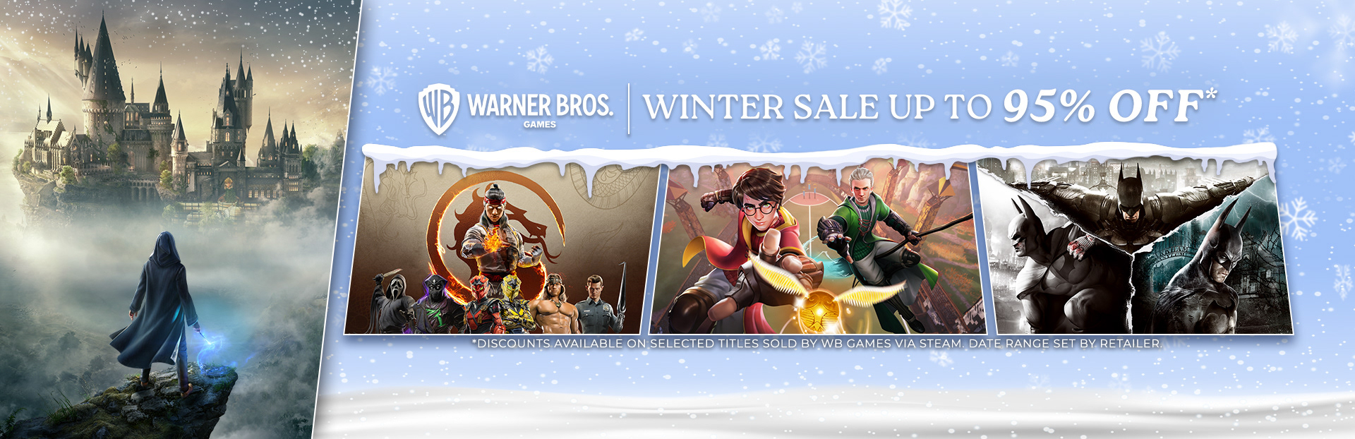
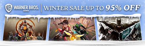
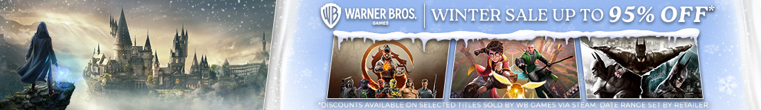
Winter Sale - Steam
Designed a seasonal visual theme for the Steam Winter Sale, combining soft gradients, falling snow textures, and icy graphic elements to create a festive and inviting tone. The frosted edges and icicle details were used to frame the promotional content without overpowering the featured titles. This layout was built to scale across multiple banner sizes while maintaining legibility, contrast, and a winter atmosphere aligned with Warner Bros. branding.